
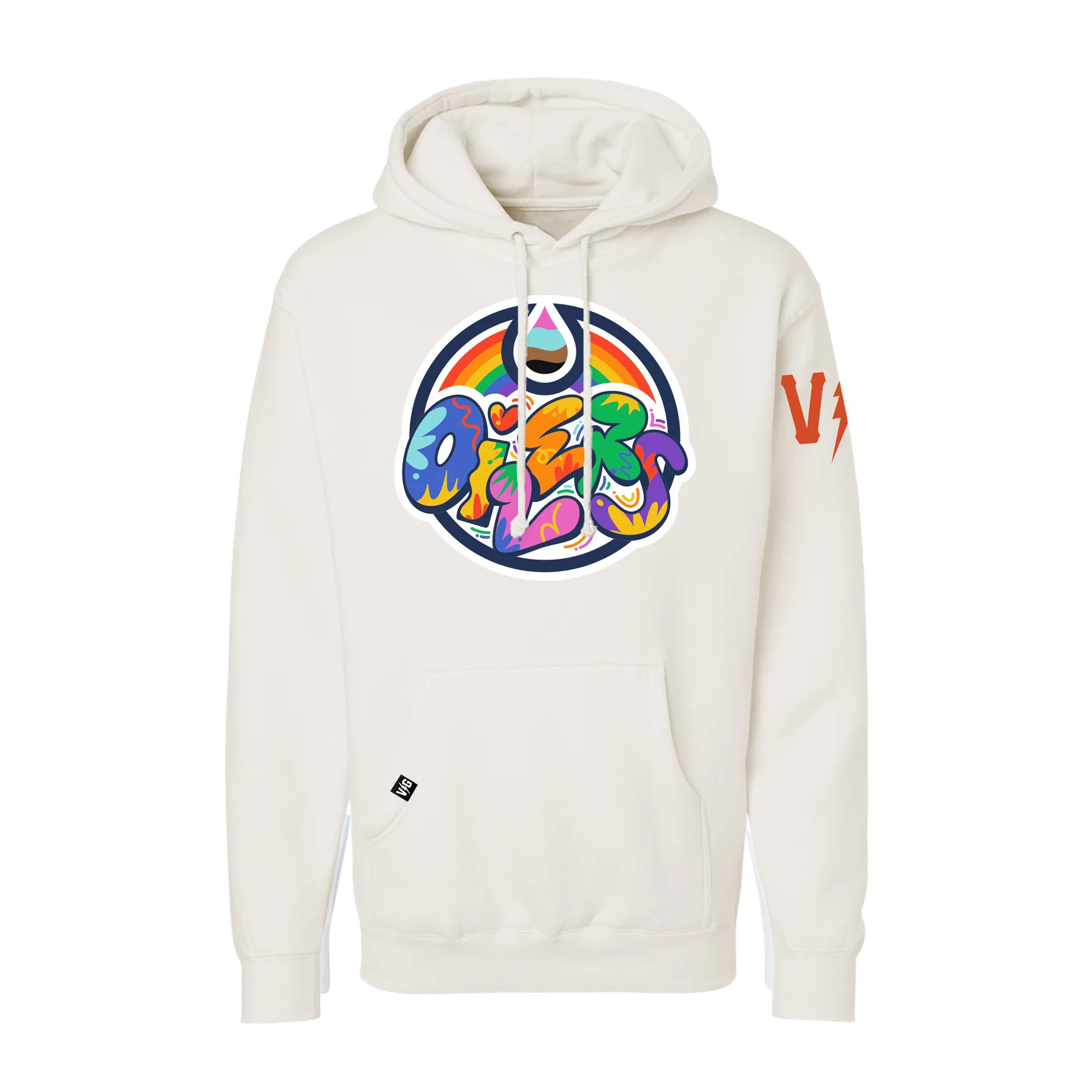
“The core theme of my design is expression, encouraging individuals to openly express their authentic selves – embracing love, creativity, and individuality as the core elements of pride. My typographic representation of the Oilers logo is meant to be fun and bold, with the core of this logo concept being inspired by pop art. Bold colours and graphic elements are used to speak to the representation, inclusivity, and love within the 2SLGBTQI+ community in Edmonton.”
– Matthew Brownoff, Oilers Pride Logo Designer
A portion of proceeds from the sale of select items will be directed to the Pride Centre of Edmonton.
https://www.icedistrictauthentics.com/collections/pride-hockey-is-for-everyone-collection
ICE DISTRICT AUTHENTICS – FLAGSHIP STORE
MON-SAT: 10:00AM – 6:00PM
SUN: 12:00PM – 6:00PM
110 – 10336 103 Street NW.
Edmonton, AB T5J 0Y9
780-664-0230
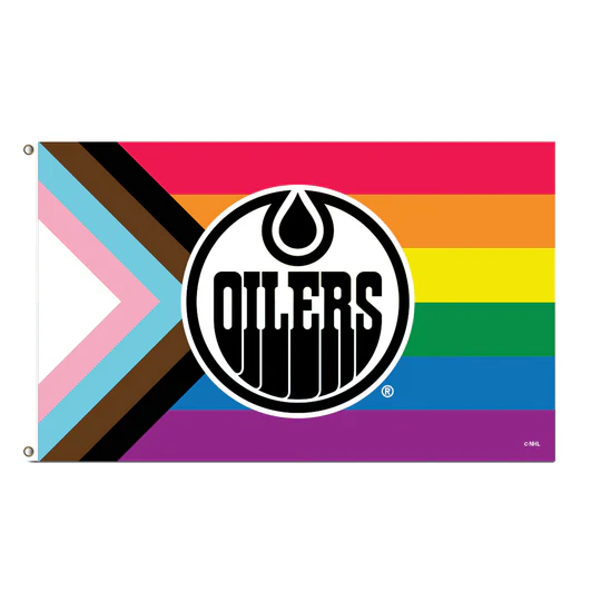
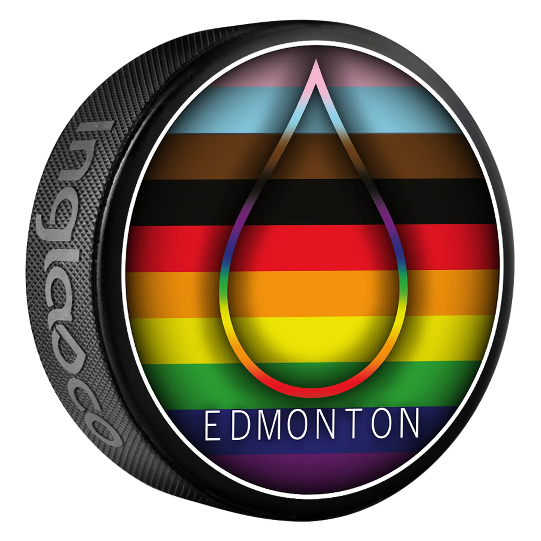
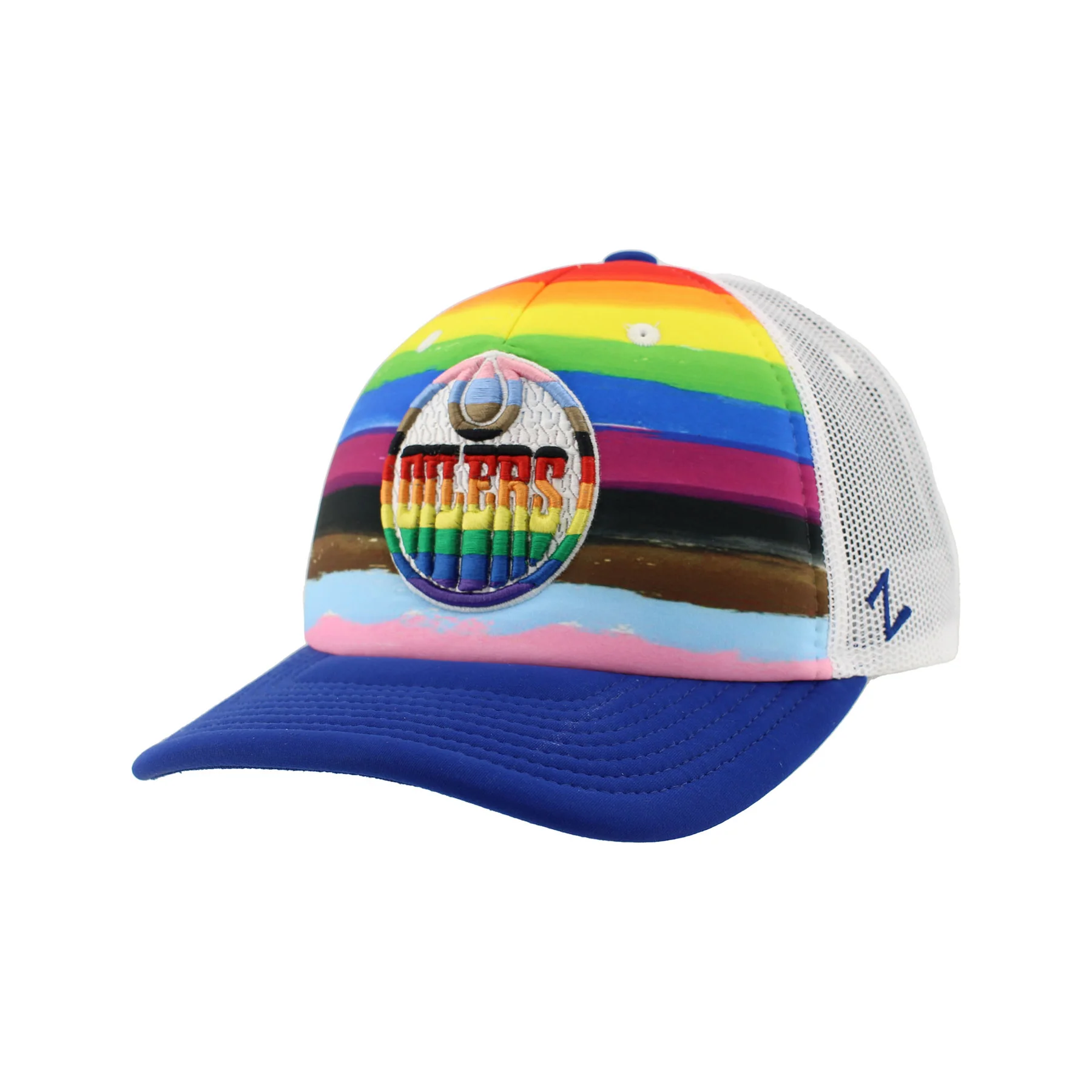
Here are 4 examples of the 43 products on the Ice District Authentics store page linked above:
![]()
Categories:


Robynn Elaschuk
Thanks for the inclusivity!